
The word Vuh in Mayan means “book”.
Vuh is a project created with the mentality of having a common design system for our projects. It contains web components that can be used on any of the major JS front-end frameworks. We created it with the next goals in mind:
- Write It Once, Use it Anywhere.
- Rapid Prototyping.
- Scalable and Future-Proof.
- A Common Design in our Projects.
Vuh is built on Stencil JS, a compiler that generates Web Components and builds high-performance web apps. Stencil combines the best concepts of the most popular frameworks into a simple build-time tool (Virtual DOM, Async Rendering, Reactive Data Binding, Typescript, and JSX). And for few browsers that do not support modern browser features and APIs, Stencil polyfills them on-demand.
But, how can I use it?
Glad you ask! Vuh is available as an npm package, so you can install it in an easy way with this command:
npm i @the-ksquare-group/vuh-stencil-componentsOnce you’ve done this, there’s still some special configuration you need to do in order to use it with React or Vue (more frameworks coming soon!).
Setting Up the Design System in React
- Create a new file on your React project’s root folder. For this example, we’ll call the new file
register-web-components.ts, but feel free to name it however you like.
import {  defineCustomElements,  JSX as LocalJSX, } from '@the-ksquare-group/vuh-stencil-components/loader';
import '@the-ksquare-group/vuh-stencil-components/www/build/vuh-stencil.css';
import { DetailedHTMLProps, HTMLAttributes } from 'react';type StencilProps<T> = {
  [P in keyof T]?: Omit<T[P], "ref"> | HTMLAttributes<T>;
};type ReactProps<T> = {
  [P in keyof T]?: DetailedHTMLProps<HTMLAttributes<T[P]>, T[P]>;
};type StencilToReact<
  T = LocalJSX.IntrinsicElements,
  U = HTMLElementTagNameMap
> = StencilProps<T> & ReactProps<U>;declare global {
  export namespace JSX {
    interface IntrinsicElements extends StencilToReact {}
  }
}defineCustomElements(window);
2. On your React project’s index file, import the file you just created.
import './register-web-components';
Setting Up the Design System in Vue
- Add the following to your Vue project’s
main.jsfile:
import { applyPolyfills, defineCustomElements } from '@the-ksquare-group/vuh-stencil-components/loader';
import '@the-ksquare-group/vuh-stencil-components/www/build/vuh-stencil.css';// if you want theming options, include your css path
import './custom-global.css';applyPolyfills().then(() => {
  defineCustomElements();
});Vue.config.ignoredElements = [/^k-/];
You can start using the components as soon as the configuration is done; there is no need to import each component on your files since they’ll be available everywhere in your project as regular HTML tags!
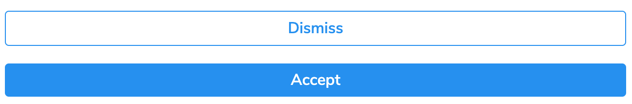
For example, this…
Vue
<k-button color="secondary" @click="doAction($event)">Dismiss</k-button>React
<k-button color="primary" onClick={doAnAction}>Accept</k-button>
…will produce this:
As you can see it is easy to use! As a plus, you have access to change the main CSS to your preference. Vuh already has a lot of basic components, such as button, avatar, dropdown, table, checkbox, etc. If you’d like to know all the components we’ve built, you can visit Vuh Storybook page, where you’ll also be able to interact with them and see all their possible variants (such as round or disabled buttons).
So there you have it! We hope you’ll try Vuh out and consider it for your own projects. Feel free to reach out or contribute to the package yourself, we appreciate all the feedback and plan to keep improving it in the future.
For more information, visit the following link.


Special thanks to David Guillermo, who did the original UI/UX work for the Vuh Design System.